
Markup App - Addressing Churn
In 2023 I designed a Markup tool for Phorest, that lets aesthetic professionals record injectable treatments visually, placing injection points directly onto a digital face or body map with the exact product and dosage attached to each point. Phorest offered digital consultations, but no way to mark up and store treatment images — a gap that was driving churn among key aesthetics clients. Markup app helped address this on a short delivery timeline, by building on existing components from the desktop app and PhorestGo.

Problems Identified
No Way to illustrate treatment visually meant losing clients
Although Phorest offered consultation forms, because markup was missing drove clients to competitors
Results
Precise structured treatment records
Although Phorest offered consultation forms, because markup was missing drove clients to competitors
Records that provide clear history
Treatment maps give practitioners a clear picture of what was done, stock items used, and the documentation standard mets insurance and legal requirements.
Churn Addressed
The feature gave at-risk aesthetics clients a reason to stay — closing the capability gap that had been pushing them toward competitors.
35%
Improved onboarding process
25%
Increase in user retention
84%
Increase in time spent on website


Process
Discover
Because this was a new area for Phorest, discovery carried real importance. I interviewed aesthetic professionals about their current markup practices, the features they expected, and their pain points with competitor tools
Design
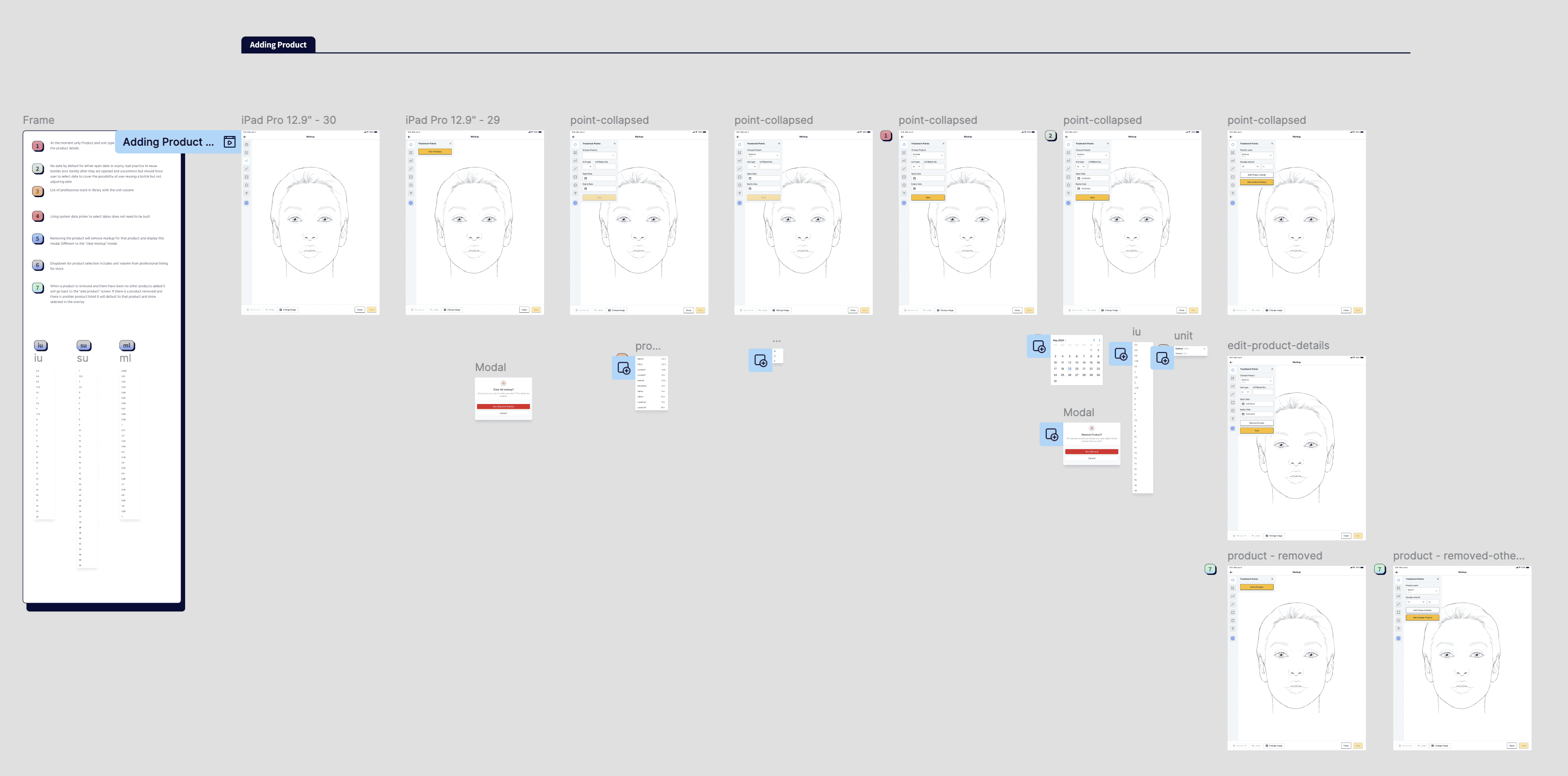
The short delivery timeline shaped the approach: I designed the Markup tool to reuse existing components from both the desktop Phorest app and PhorestGo rather than inventing new patterns. I defined a workflow that connected to what clinics already had select a client from the existing database, apply treatment points, save, and retrieve the record for future treatments.
Prototype
I prototyped the markup flow in Figma and ran usability testing with aesthetic professionals to validate that it matched their expectations, refining the design through iterative testing cycles.
Handover
We evaluated readily available plugins that could deliver the core canvas functionality rather than building from scratch therefore reducing project complexity and engineering time. I documented the UI elements, interactions, and design decisions in Figma, and worked with engineers through build until the feature was ready to launch.
Information Architecture
Based on the research findings, we restructured the app's navigation and content, prioritising features and information according to user needs.
Wireframing and Prototype
We designed low-fidelity wireframes to visualize the new layout and navigation, iteratively refining them based on user feedback. Afterward, we built a high-fidelity, interactive prototype to test the design.
Usability Testing
We conducted usability tests with a diverse group of users to validate the design and identify areas for improvement. Based on the feedback, we made necessary adjustments to the design.



Conclusion
The markup app had a different approach compared to the PhorestGo redesign as it aligned more closely to the business goal of preventing churn , entering a new market also meant a lot of initial discovery work in speaking to our clients early on while understanding competitors in the space.
Understanding technical constraints early in the project and communicating these to stakeholders more regularly could have helped some delivery issues towards the end of the project. Understanding the importance of stakeholder communication early was a skill I further developed in my masters in IADT